The Psychology of Color in Branding: What Red and Pink Say About Your Brand
Have you ever wondered why some brands use bold reds while others opt for soft pinks? Colors are more than just decoration—they shape emotions, influence decisions, and define brand identity. At Playground Studio, LLC, we specialize in helping businesses choose the right colors to make a lasting impression. But what exactly do red and pink say about your brand? Let’s dive into the fascinating psychology behind these powerful hues.
The Power of Color in Branding
Color is one of the first things people notice about a brand. It evokes emotions, triggers memories, and even influences purchasing decisions. Branding services at Playground Studio, LLC, ensure that businesses use the right colors to connect with their audience.
Understanding Color Psychology
Before choosing a brand color, it’s essential to understand how different colors affect human behavior. Psychologists have studied color associations for years, revealing how hues impact consumer perception.
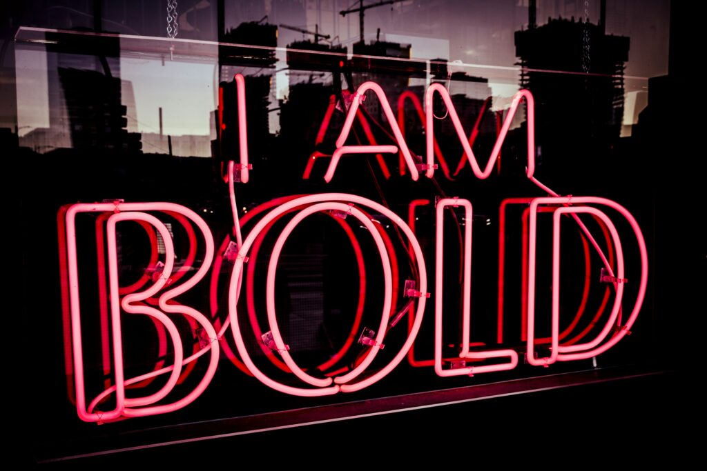
Red: The Color of Passion and Power
Red in Branding: Strength, Energy, and Urgency
Red is bold, fiery, and full of life. It commands attention, stimulates appetite, and conveys excitement. Brands using red often want to evoke urgency, passion, and energy. Think of clearance sales, fast-food chains, and sports brands.
Famous Brands that Use Red Effectively
- Coca-Cola: Happiness and excitement
- McDonald’s: Urgency and appetite stimulation
- YouTube: Energy and engagement
Pink: The Color of Compassion and Playfulness
Pink in Branding: Softness, Romance, and Creativity
Pink is often associated with femininity, tenderness, and fun. It can make a brand feel approachable, youthful, and warm. While traditionally linked to beauty and fashion, many modern brands use pink to stand out in creative ways.
Famous Brands that Thrive with Pink
- Victoria’s Secret: Romance and luxury
- Barbie: Playfulness and nostalgia
- T-Mobile: Boldness and uniqueness
Choosing Between Red and Pink for Your Brand
Should your brand go bold with red or soft with pink? It depends on your target audience, industry, and brand personality. If you want to evoke strength and passion, red is your best bet. If your brand aims for warmth and approachability, pink may be the way to go.
Combining Red and Pink for Unique Branding Strategies
Mixing red and pink can create a dynamic, eye-catching identity. Brands that blend these colors can express both power and creativity, making them stand out in competitive markets.
Cultural Meanings of Red and Pink Around the World
Color perceptions vary globally. While red symbolizes good luck in China, it represents warning signs in Western cultures. Pink is associated with sweetness in Japan but can symbolize rebellion in Western pop culture.
Color Combinations: How Red and Pink Interact with Other Colors
Pairing red and pink with other colors can create different effects:
- Red & White: Clean and professional
- Pink & Gold: Elegant and luxurious
- Red & Black: Bold and authoritative
- Pink & Blue: Playful and balanced
The Role of Red and Pink in Digital Branding
In the digital age, colors impact how users interact with brands online. Red draws attention to call-to-action buttons, while pink enhances social media aesthetics.
How Playground Studio, LLC Can Help You Choose the Right Color
At Playground Studio, LLC, we specialize in branding services that align with your business goals. Whether you need a logo redesign, a brand identity consultation, or a complete rebranding, we help you select colors that resonate with your audience.
Conclusion: Making an Impact with Color
Colors are powerful storytellers in branding. Red and pink each offer unique benefits, shaping how consumers perceive and connect with brands. Choosing the right hue can make all the difference in establishing a strong and memorable identity.
FAQs
1. Why is red a popular color in branding?
Red evokes strong emotions, creating a sense of urgency, excitement, and passion, which makes it ideal for brands wanting to grab attention.
2. Is pink only suitable for feminine brands?
No! While pink is often associated with femininity, it’s also used in tech, sports, and other industries to convey playfulness and creativity.
3. Can a brand use both red and pink effectively?
Yes, combining these colors can create a bold yet inviting identity, appealing to a broad audience.
4. How do I choose the best color for my brand?
Consider your brand’s personality, target audience, and industry trends. A branding studio like Playground Studio, LLC, can help you make the best choice.
5. What are some industries where red and pink are most effective?
Red works well for food, retail, and sports brands, while pink is great for beauty, fashion, and lifestyle industries.
By understanding the psychology behind red and pink, you can strategically use these colors to build a brand that truly stands out. Need expert guidance? Contact Playground Studio, LLC today for top-tier branding services!
Ultimately, If you are ready to take your project to the next level. Contact us today to schedule your free consultation with one of our senior designers.