The Role of Typography in Shaping Brand Identity
In today’s visually driven world, typography plays a more significant role in shaping brand identity than ever before. From the fonts used on websites to product packaging, typography communicates more than just words—it conveys the personality, tone, and values of a brand. Choosing the right typography can make a brand memorable, while poor choices can confuse or alienate an audience. In this article, we’ll explore how typography contributes to brand identity and why it’s a crucial element of design strategy.
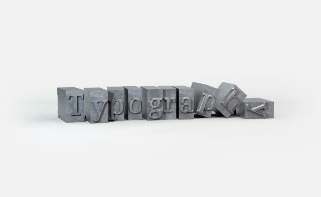
What is Typography?
At its core, typography is the art and technique of arranging type. It involves the selection of fonts, sizes, spacing, and alignment to create visually appealing and readable text. Typography goes beyond mere aesthetics; it’s a communication tool that influences how the audience perceives a brand.
Typography includes several components, such as:
– Typeface: The design of the letters, such as Arial or Times New Roman.
– Font: A specific weight or style of a typeface (like bold, italic, or regular).
– Kerning and Tracking: The spacing between characters and words.
– Hierarchy: The arrangement of text elements to guide the reader’s eye.
Each of these elements can either enhance or detract from the overall brand message.
Why Typography Matters in Brand Identity
Typography is more than a design choice—it reflects the essence of a brand. Just as color schemes and logos are essential to brand identity, typography can communicate tone, establish a brand’s voice, and influence how people feel about the brand. Think of typography as the “voice” of your brand. It speaks to the audience, even when no words are spoken aloud.
Here are some reasons why typography is crucial for brand identity:
Establishes Brand Personality
The style of typography a brand chooses says a lot about its personality. For instance, a bold, modern sans-serif font might convey a sense of innovation and progressiveness, while a more elegant serif font suggests tradition and trustworthiness. Just as the tone of voice reflects who you are when speaking, typography sets the visual tone of a brand.
Creates Consistency
Consistency is key in branding. When the same typography is used across all platforms—websites, advertisements, packaging—it creates a unified brand experience. A consistent typographic style makes the brand instantly recognizable, helping to establish trust and familiarity with the audience. It also reinforces the brand’s identity every time a customer interacts with it.
Enhances Readability and Engagement
Typography influences how easily a message can be read and understood. If your audience struggles to read your content because of poor font choices or crowded text, they’re likely to disengage. Clear, legible typography encourages people to spend more time on your content, making it more likely they’ll engage with your brand and remember it.
Differentiates Your Brand
In a crowded marketplace, typography can help a brand stand out. Choosing a unique typeface or custom font sets a brand apart from competitors. Just as a logo or color palette can distinguish one brand from another, typography becomes a recognizable element that helps establish a brand’s distinct identity.
Conveys Emotion and Tone
Different fonts evoke different emotions. A playful, quirky font may suggest fun and creativity, while a sleek, minimalist typeface can evoke professionalism and sophistication. Typography helps brands convey their core message in a way that resonates emotionally with the audience.
For example:
– Serif fonts (such as Times New Roman) often convey reliability, authority, and tradition.
– Sans-serif fonts (such as Helvetica or Arial) can appear modern, clean, and approachable.
– Script fonts (such as Brush Script) may evoke elegance, creativity, or formality.
How to Choose Typography for Your Brand
When choosing typography for your brand, consider the following factors:
Brand Values and Personality
What does your brand stand for? If your brand is youthful and fun, you might opt for a playful, creative font. If your brand is more formal or corporate, a classic, refined typeface may be more appropriate.
Target Audience
Who are you trying to reach? Typography that appeals to a younger audience may differ dramatically from fonts that resonate with a more mature, professional crowd. Always consider who your typography will speak to.
Legibility
Your typography should be easy to read across different formats and devices, especially in today’s mobile-centric world. A font that looks great on a billboard may not translate well to a smartphone screen.
Versatility
The typography you choose should be versatile enough to be used across multiple platforms—websites, print materials, packaging, social media, and more. This ensures a consistent brand experience across all touchpoints.
Emotional Impact
Fonts have the power to evoke emotion. Think about the emotional response you want from your audience and choose typography that reflects that feeling. Whether you want to evoke trust, excitement, or calm, the right font can reinforce your message.
Typography is an essential element in shaping brand identity. It goes beyond simply making words look good on a page—it communicates the essence of a brand and plays a key role in building recognition, trust, and loyalty. By carefully selecting the right typography, brands can create a visual language that resonates with their audience and enhances their overall brand experience. Whether you’re launching a new brand or rebranding an existing one, investing in the right typography can make all the difference.Ultimately, If you are ready to take your project to the next level. Contact us today to schedule your free consultation with one of our senior designers.